Friday, February 12, 2016

Dirk Bakker - Series 1.0


Artist Statement
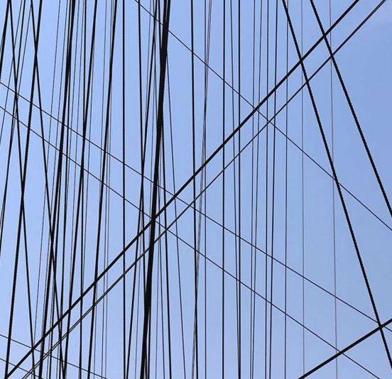
This is the first series many based on the photography of Dirk Bakker, a famous Dutch architecture photographer. He is well known for his symmetrical images that often include elements of repetition, are square-shaped and usually do not include depth. To create images that evoked these elements, I had to walk around and take pictures of parts of buildings that were symmetrical, this usually meant images of windows and walls. In order to capture these parts of buildings without showing any element of depth, I had to make sure that the frame of the camera was at or very near to perpendicular to the subject. To further make my images more similar to his style, I cropped each photograph into a square and positioned the limits of the crop to only focus on the symmetrical aspects of each image. This process allowed me to create a good first step in this project. For the next series, I would like to capture more images of larger buildings or of parts of buildings that have a more aligned perspective.

Tuesday, February 2, 2016

Series Plan


Artist Statement
I want to follow the style of Dirk Bakker, a dutch artist who is famous for his images of architecture in and around Amsterdam. His images revolve around observing and capturing lines and patterns in urban landscapes in a somewhat minimal and abstract way. Most of his images are balanced, some of them are symmetrical, and others use the rule of thirds. For this project, I want to create images of buildings or objects in and around San Francisco that capture and emphasize lines and patterns. I will also incorporate the rule or thirds in some photos, but make sure to create balanced images with a neutral tone. To do this, capture the fronts of different buildings or groups of buildings with a focus on capturing lines. My images will not have much depth.

Friday, January 29, 2016

Multi-Frame


Artist Statement
For this project, I had to make multi frame collages. The goal of this project was to cohesively put together different images, meaning that they shared similar aspects without looking like parts of the same image. Some of the images also play with changes in time between frames. To achieve this, I looked through my personal photo library and found pairs or groups of images that I had taken in the same place, but that each had different perspectives of the consistent landscape. Then, I imported groups of similar images into Picmonkey and used the collage feature. After choosing the layout of the frames, I placed the images into the frames and positioned them to look cohesive, but not so similar that they looked like one image. For some of the frames, I edited photos to make the lighting and the exposures more cohesive, and I also rotated some and put others in black and white. After doing this, I chose the frame thickness and color that fitted the images best. Usually this was a thin black and white frame. These steps created the desired products. However, if I had more time to enhance my photos, I would individually edit some images to be more precisely cohesive.

Wednesday, January 20, 2016

Memory Layer


Artist Statement
For this assignment, I had to create images that elicited memories or emotions of the past. To do this, I looked through my personal camera roll as well as previous projects from photography class. I then chose images that I had memories about taking or about when I took them and that I felt that I could edit to look like genuine old images. After selecting the images, I edited each one in picmonkey© by overlaying various antique-looking effects such as layers from the edifice, smudge, or daguerreotype groups. I adjusted the transparency of each effect so as to ensure that the images did not look like pictures with effects on top. These steps allowed me to create 10 successful images that evoked old time memories or emotions about the past. If I had a few more days to work on this project, I would have chosen more images, edited them and then spent more time selecting the best images.

Monday, January 11, 2016

Motion Abstract


Black and White


Colored


Artist Statement

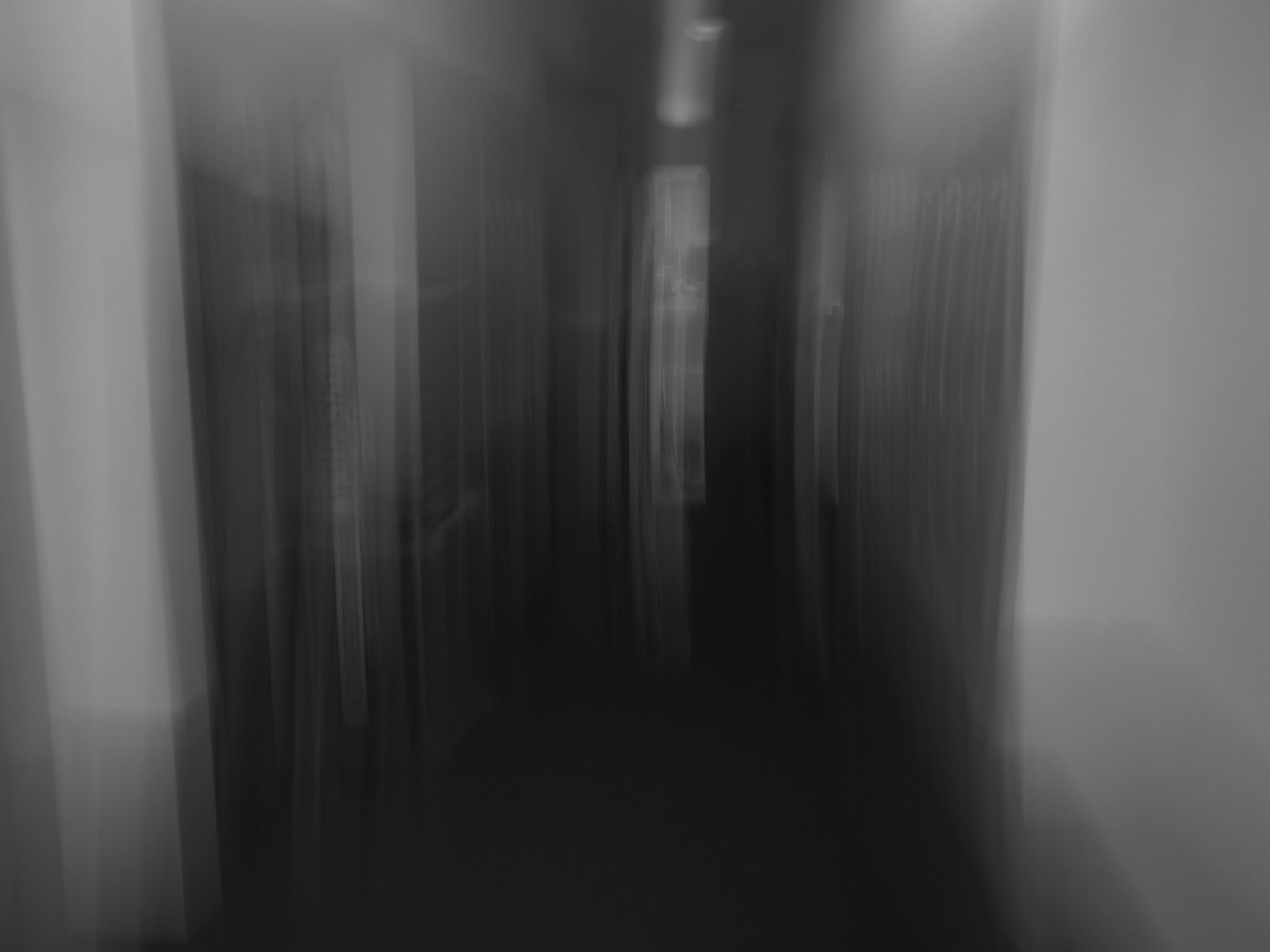
For this assignment, I had to make images that were abstract, that showed motion, and were mysterious. The motion that the images show help create the abstract effect with a mysterious feeling. To create these images, I took a number of different steps to achieve the effect. First, before taking images, I adjusted my camera's settings to Aprature Priority, which allowed me to adjust how long the camera would expose for during each photo. Then when taking photos, I lengthened the exposure, clicked the capture button and moved the camera around the objects that I wanted to have in the frame. This created the motion effect and essentially blurred the shapes of the subjects of each photo. I mostly focused on ordinary objects like hallways and stairs. To create a more mysterious effect, I put some of the images in black and white and also turned down the temperature and vibrancy of the colors in some other photos. All of these steps came together to create 15 very successful motion abstract images.