Wednesday, May 25, 2016

Self-Portraits


Artist Statement
To do this I got someone to take pictures of me with elements of architecture to create interesting shapes in the background. To add variety, each photo is taken at a different distance and angle, but all photos are cohesive because they are portraits of me. I edited these photos into black and white and increased the contrast to add interest and to exaggerate the interesting architectural shaped that permeate every image.

Best Edit


Artist Statement
For the best edit, I gathered fourteen cohesive and quality images from this project. In the editing process I edited out images that were low quality or were appealing or of normal objects. I kept the images that had interesting shapes, lines, textures and shades. I also made sure that the images were not too obvious in order to add abstraction and mystery. These images represent the best and most cohesive work from my project.

Friday, May 20, 2016

Fixtures On (And Off) The Wall


Artist Statement
For this batch, I tried to continue my work with capturing fixtures and more. All of the photos are abstract and are in black and white. To improve, I worked with texture, lighting, and shades to add variety and to create more interesting images. I also used shadows in some images to create more interesting divisions of space. The combination of these new techniques allowed me to create more interesting images that are both abstract and complex.


Friday, May 13, 2016

Fixtures - 2.0


Artist Statement
For this batch, I continued photographing interesting objects and fixtures on ceilings, floors and walls. I kept all of the images in black and white and made abstract backgrounds to highlight the interesting shapes present. To improve on my last batch, I tried to photograph more unique and less common fixtures while also taking sharper images. Sharper images betters the quality of the images by showing the interesting textures that often accompany these fixtures. The combination of all these things allowed me to create more abstract, unique, and interesting images than the previous batch.

Friday, May 6, 2016

Fixtures - 1


Artist Statement
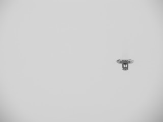
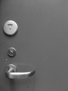
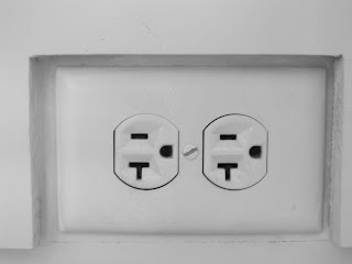
For this project, I captured interesting objects or arrangements of objects on walls, ceilings or floors inside and outside of buildings. To do this, I first walked around to find interesting objects that were unordinary. I then lined my camera up exactly perpendicular to the object I wanted to focus on. This way, the object would be straight in relationship to the edges of frame. While photographing, I added interest to the images by leaving interesting arrangements of negative space. All of the images are fairly minimal with an object and lots of negative space. In editing, I put every photo into black and white to show the many different shades of gray and shadows and the arrangements of the subject and negative space.